January 16th, 2009 — art, design, economics, geography, philosophy
A few weeks ago, my wife picked up a book called The Written Suburb at a Greenwich Village used bookshop about Chadds Ford, Pennsylvania, and how it was an invented, postmodern place, designed to become a mythological homeland of the American realist movement.
As the area was home to painters like Howard Pyle, N.C. Wyeth, and Andrew Wyeth, its history was certainly intertwined with that of American art. The Brandywine River Museum has done a fine job selling itself as the First Church of Delaware Valley Realism and enhancing the myth of Brandywine River as a seat of not just Realism but also of the Real.
As a teenager, I had visited the Brandywine River Museum, and when pressed to write a paper for an art class, I chose to write about the work of Maxfield Parrish, the prolific American illustrator whose work is featured there. I was enchanted by his technical method, which employed multilayer transparencies and unusual materials, but my teacher disputed that his stuff was really “art” and undoubtedly had wished I’d chosen to write about Picasso or Millet — somebody “real.”
With the news of the death of Andrew Wyeth, the whole question of whether the Brandywine River school really produced “art” is back in the news again. The Metropolitan Museum of Art in New York refused to show his “Helga” paintings on the grounds that they were not, or at least weren’t very good.

The Museum of Modern Art keeps Andrew Wyeth’s most famous work Christina’s World (1949) in a back corner, and it’s always fun to watch people discover its presence. They stumble upon it, and are surprised at how it moves them. As an icon, they are completely ready for it to be trite and clichéd, but in person it still seems to catch people up.
Art purists would say that the only valid art is work that’s done for art’s sake alone: without guile, without intention to build an audience, without regard to populism. Arguably, only art that fits this definition can advance what’s been done before it in the same vein: populism and intellectual progress usually don’t mix.
However, another definition of art is any work that conveys emotion, and on this score, the Wyeths and the Brandywine River School perform well enough to merit attention. That 200 million people can name Wyeth as one of their favorite artists shows his communication has been effective, however invented or populist it may be.
The intersection between art, populism, and commerce is an interesting place to poke around. Here are the seams of our culture, where values, money, and progress bang up against each other.
The Brandywine River Museum touts the artistic authenticity of an invented place, and the Wyeths, Pyle, and Parrish are all promoted as invented artists, designed to insure the flow of tourist dollars into Chadds Ford and Kennett Square — beautiful places, to be sure, and if you squint you can convince yourself the place conveys the feelings the art is trying to make you feel — especially at this time of year, when the browns, greys, white and cold look and feel just like a Wyeth landscape.
But in the end, that’s a leap of faith on the part of the viewer. Sometimes art requires the viewer to become complicit in its own invention.
December 16th, 2008 — art, business, design, economics, social media, software, trends, visualization
Last week I had the privilege of attending Le Web ’08 in Paris, which was artfully composed and hosted by Loïc and Geraldine Le Meur. It was an interesting event; I always like getting an international perspective on technology and business.
What was perhaps most interesting was the constructive tension between creativity and business on display there.
The theme of the conference was love — a primary human emotion. However, many of the guests and speakers were aggressive, technically-minded business people. But many of the speakers were artists, musicians, and researchers.
I’m fascinated by the complementary roles of “right brained” activity (art, creativity, design, visual thinking) and “left brained” activity (analysis, rule-based systems, quantitative modeling, finance) in business, particularly on the Internet.
Loïc rightly justified the use of the theme of love for the conference by saying that it is the primary emotion that drives an Internet entrepreneur to give birth to a new idea or technology. Surely this is true, but I’d argue that there are deeper justifications for using an emotion as the theme for an Internet business conference.
Developing innovative Internet business ideas requires a sense of play and real play only comes about when people tap into their creative, artistic brains. Not to get all philosophic, but Immanuel Kant stated in his Critique of Judgement that real advances in art can only be made when art is undertaken for art’s sake alone, that is to say that it is done without any expectation of value, but rather is done merely to satisfy the curiosity of the artist (or designer, or researcher, or scientist).
So, all this means that Internet business people are in desperate need of right-brained influence. It’s where the ideas come from.
My friend Paola Antonelli, curator of architecture and design at the Museum of Modern Art, is quoted as saying, “Good design is a renaissance attitude that combines technology, cognitive science, human need, and beauty to produce something that the world didn’t know it was missing.” Love is surely a human need and is arguably a driver for all good design. And aren’t we all trying to design the things that the world didn’t know it was missing?
William McDonough, famed architect and designer, has stated, “Design indicates intent,” and shouldn’t our intent be to love one another and to love our planet? Isn’t that what we should be trying to achieve in designing our Internet startups?
I was interested to see how many people literally got up and left the plenary session when the subject matter turned to art or music or emotion. Some people were there strictly for left-brained content (how to raise money, how to survive the recession, etc) while others seemed to be more open to the right brained content.
Personally, I enjoyed the presentations by Itay Talgam (conductor), Chris Anderson (curator, TED), Helen Fisher (researcher on human relationships), and Robin Good (on education) the most. I’d say these were the most right brained. Things I enjoyed the least were the presentations by Messrs. Arrington and Gillmor, especially the unfortunate bickerfest that is the Gillmor Group that ended the conference. This is not to say that this kind of “left brained, rule-based” discussion doesn’t have a role, but it doesn’t generate anything really. All it does successfully is tear people apart; it’s not creative, and it doesn’t fuel anybody’s soul.
So, I applaud Loïc and Geraldine for a really creative and fun event, and one which truly gave me a sense of what is currently going on in the heads of European web entrepreneurs. I would simply encourage steering even further into the realm of emotion, creativity, design, and art – as it’s this kind of content which will pull us out of the recession, as it’s this kind of thinking that will help people create art and beauty for art’s sake alone, and these will be the innovations that the world didn’t know it was missing.
Rock on, Loïc, and let your right brain show; it’s your best side.
November 23rd, 2008 — art, design, software, trends
I was 5 years old in 1977, and all-in-all, I’d say the aesthetics of the day made a big impression on me. Here are some of the things that, looking back on it 31 years later, seem to share a common visual language and which were most influential on the next 10 years in movies, computing, games, and package design.
The rich colors and ground-breaking special effects of Spielberg’s 1977 Close Encounters of the Third Kind marked the beginning of a new era in filmmaking and ultimately set a goal for computer graphics and video games. The nascent digital graphics industry was barely capable of producing color “high-res” graphics, but folks knew that when they could, these were the kinds of graphic effects they wanted to make.


Maybe it’s just me, but it seems to me that Close Encounters, Atari, Space Invaders, and Star Wars were all linked together with a common visual sense. I think it’s pretty obvious that Atari ripped off Close Encounters for the Space Invaders packaging.

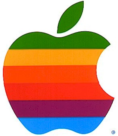
Likewise, the colorful “light organ” used to communicate with the aliens in Close Encounters is a close cousin, visually, to the famous Atari game Breakout. Steve Jobs was one of the designers of the arcade version of Breakout. Note the similarity to the original “rainbow” Apple logo.

Computer-generated music and sound was still in its very earliest stages, but the simple John Williams melody put to such brilliant use in Close Encounters was the sort of musical coda that aspiring game designers and programmers could latch onto and reproduce. John Williams of course scored hit after hit in movie soundtracks, but the Close Encounters and Star Wars themes of 1977 were hugely influential.
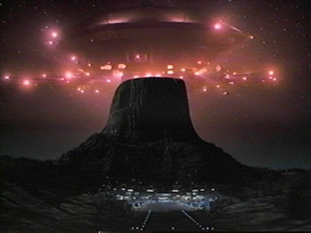
Spielberg used the Rockwell International logo (center) to clever aesthetic effect in Close Encounters; contractors at the secret military base at Devil’s Tower sported it, visually quoting the Devil’s Tower landscape. Of course, it’s interesting to note how similar the logos are for Atari, Rockwell, and Motorola – all major corporations of the day.
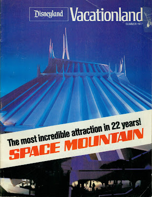
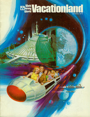
Disney got into the act in 1977 with the opening of Space Mountain. While they may not have been directly influenced by imagery from Close Encounters, Atari, or Star Wars, it’s clear that the popular imagination was drawing from common influences like Kubrick’s 2001: A Space Odyssey from 1969.
Of course the biggest influence of 1977 was George Lucas’ seminal work, Star Wars, which interestingly was not initially marketed using its iconic title graphics in its movie poster. It took a little while, and for the film to settle into its status as an international blockbuster, for it to adopt the visual marketing language that would become familiar in the release of the subsequent films in the series.
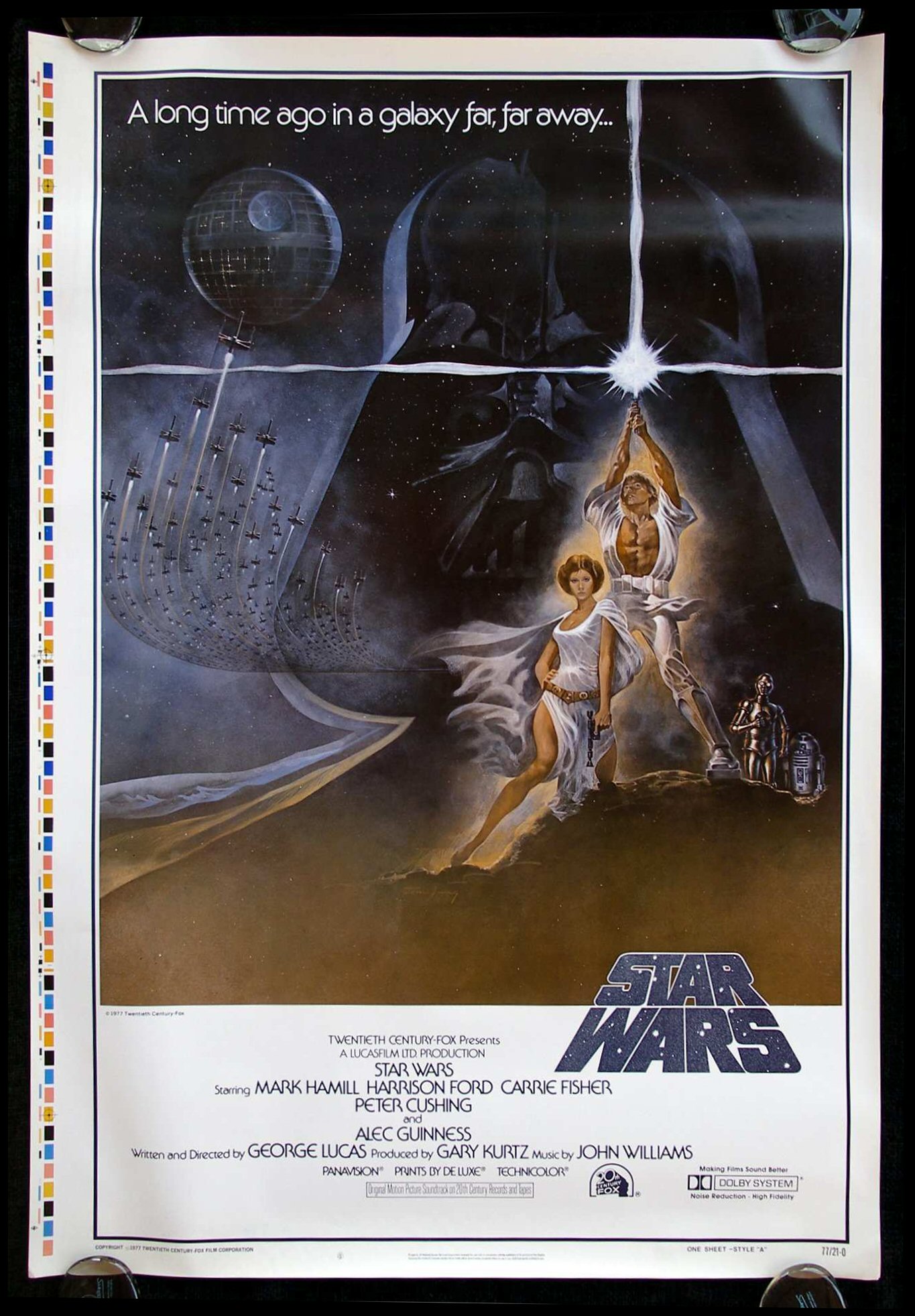
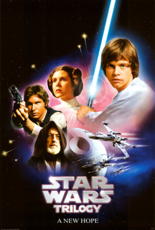
Arguably, the latter sans-serif Star Wars bubble letters were more inline with the iconography of Close Encounters, Atari, and the other major visual influencers of 1977. I’d bet the previous, blockier Star Wars graphic was designed in 1975 or 1976, before the film and its title graphics were completed. And the very earliest Star Wars art from the 1973-1974 timeframe used a hand-drawn serifed font — a different look altogether.


The dirty, realistic “used universe” designed for Star Wars was also influential. Unlike previous science fiction and space films, Lucas imparted his universe with a lived-in, beat-up look that added a romantic touch of decay to an imagined future — or past.
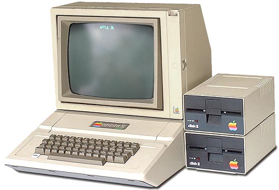
The Apple ][ was a direct result of Jobs’ (and Wozniak’s) work on Breakout, and the color graphics circuitry has much in common. And I don’t think it’s any stretch to say that the generation of Silicon Valley idealists that designed the Apple ][ and Atari 800 were hugely influenced by the blockbuster science fiction films of the day. While the early Apple designs lacked sufficient economy of scale or budget to have a very “designed” aesthetic, the Apple II does look like something straight out of the Star Wars universe. And the ugly Disk ][ and portable monitor are things that just didn’t get attention yet. Maybe they’re dirty, lived-in artifacts of a galaxy far, far away?
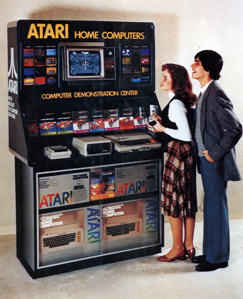
Atari, on the other hand, with the success of the 2600 VCS and its computers, had fully embraced the 1977 aesthetics and by 1980 had full color graphic packaging and a line of “Star Wars” compliant peripherals. And the packaging for the programs borrowed from movie poster designs.
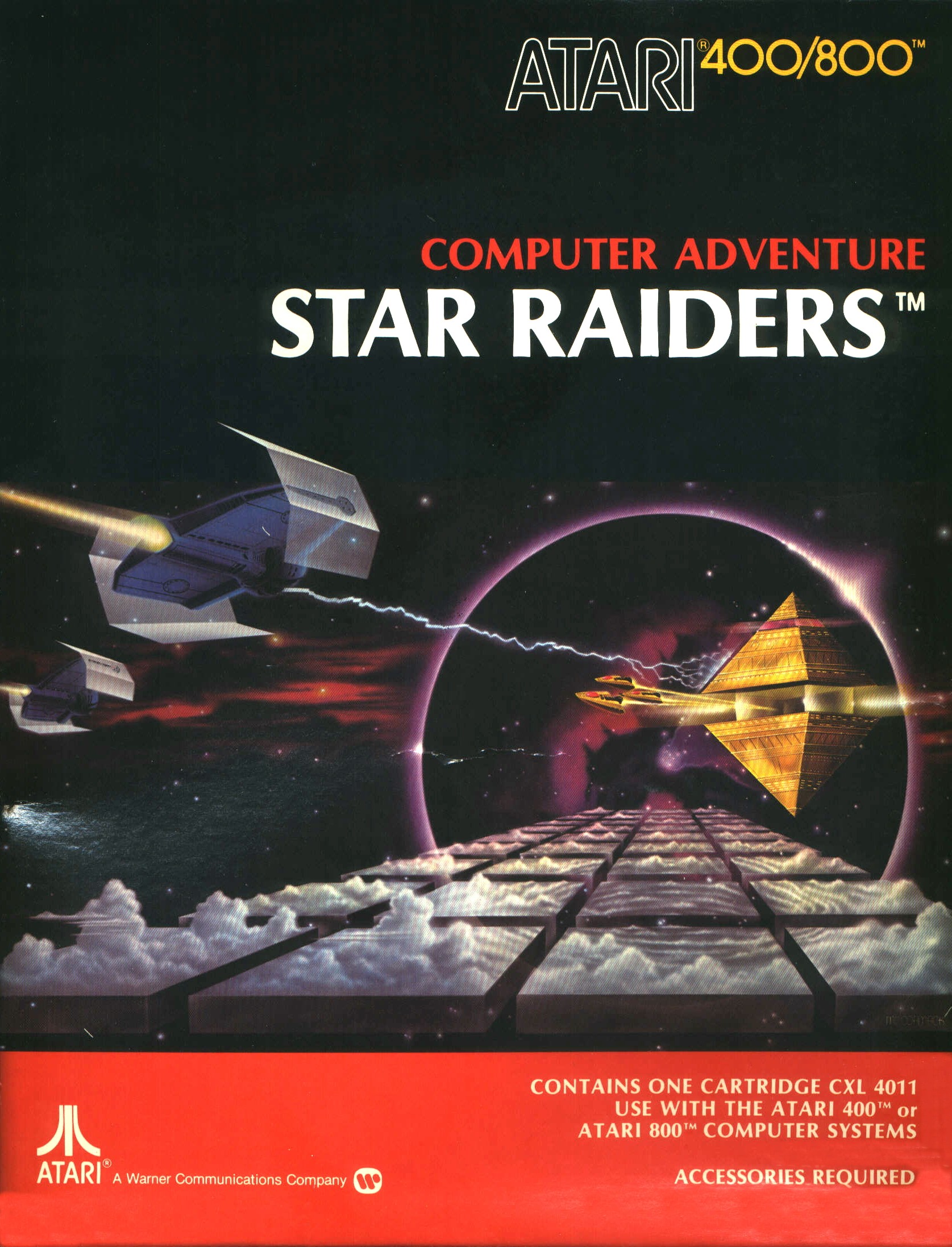
Quite clearly Star Raiders (1979) borrowed directly from Star Wars. In fact, looking at this graphic, I’m now surprised that Atari didn’t get a phone call from Lucas. I guess this was back in the day before tie fighters were Tie FightersTM.
Media critics have argued that Star Wars and Close Encounters of the Third Kind marked the start of the era of blockbuster films, and a general shift in popular culture away from smaller, more thoughtful cinema and towards a populist, anti-intellectual approach in art and film in particular.
Whether that’s true or not, I think it is fair to say that 1977 did mark the year of a seismic shift in aesthetics that has been felt all the way through today in computing, gaming, film, and product packaging. Perhaps 1977 is a kind of bright-line marker for popular art — before and after seem to be from entirely different eras.
The fact that I’ve spent most of my life selling products or working in technologies directly influenced by this powerful aesthetic sense is likely no coincidence: to be young in 1977 was to be indelibly marked by the look and feel of a new era.
November 12th, 2008 — art, design, economics, mobile, programming, social media, software, travel, trends, visualization

Boulevard St. Michel, Paris, Google Streetview
So many wonderful things going on in this photo, and it’s all entirely unintentional. With such a vast quantity of visual data collected for Google Streetview, how many “artistic” scenes lurk within it? How might one build a machine for finding the art within this dataset? Can it be crowdsourced?
Want to work on this with me? If so, ping me.